WordPress – Not Just For Blogging

WordPress used to serve just as a blogging software, but according to a WordPress survey, 66% of respondents use WordPress as a Content Management System (CMS). It has developed into a powerful platform over the years. WordPress is much more innovative than plain website building. The growth of WordPress began with new products such as plugins or themes, and now there is so much more. It has become to be known as a popular platform more than anything else. No matter what kind of business you have WordPress has what you need to be able to display your product in the most appealing way.

david-coleman-website
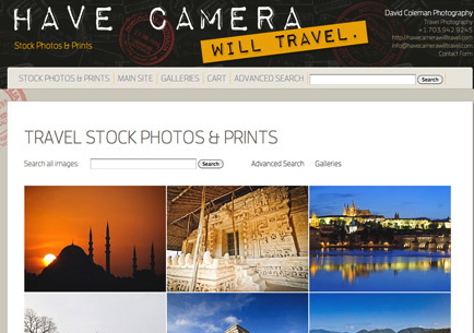
WordPress developers have developed different “plugins” that will cater to your specific needs. One of them is called Photoshelter. It is used for photographers to create a portfolio and website for their business. It is search engine friendly, therefore attracting new clients. It is also used as a selling tool where photographers can even sell prints or downloads. Another WordPress based platform is Tickera which is used for online ticket sales. This is especially great for event organizers because it allows users to buy tickets directly on the site, deliver them digitally, and check-in at the event with their iPhone through the app.

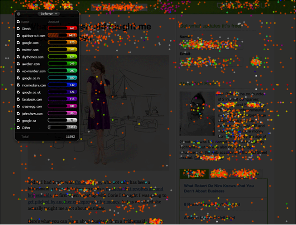
Scribe was created by Copyblogger Media and is a content marketing software. It is basically your own personal writing assistant that uses three simple steps: research, optimize, and connect. It will show you topics and keywords that your audience prefers, analyze your content, and will help to crosslink your content to increase usability and time on site.

Screen Shot 2013-11-18 at 11.00.14 AM
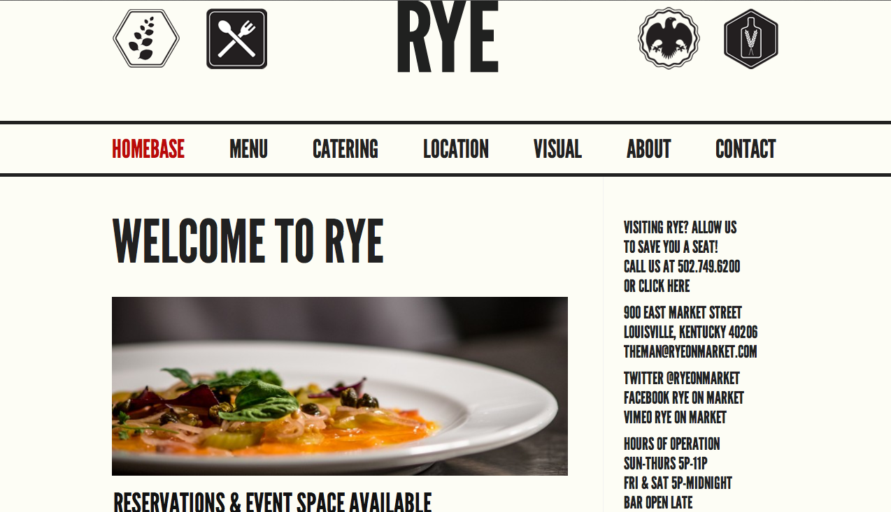
Not only is WordPress great for all types of sites listed above, it can also be used to create beautiful websites to share your wedding on your own website, or share your music with your fans. Also, using a WordPress site for your restaurant allows users to view your location and hours, menu, and even make reservations right from their mobile device like the ones Innovise helped to create for Louisville restaurants Rye and Decca.

Source


Surviving the Five Second Blink Test

As of today, there are over one billion smartphone users in the world, and this number increases every single day. For entrepreneurs, innovators, and disrupters this means that there are tons of technologically capable people out there on the web that are searching for quick and effortless solutions to their problems. Studies have shown that if you don’t engage a user within just 500 milliseconds, they are likely to leave your page and never come back. That is what they call the blink test. In the blink of an eye you either lose or win over your visitor.

To go about retaining people within that short amount of time you should first know what gives a bad first impression. High visual complexity or low prototypical design are two major factors that can turn away a user in no time. Having a mix of a little bit of both in your website is favorable. The next thing to consider is the layout and overall design. Having a well designed custom layout for your website is the best way to go. Many benefits will come from hiring a web designer to customize your layout/website. Unique design, a more professional look, search-engine friendliness, and overall better quality are just to name a few.

heatmap-designHeatmapping and metrics should also be taken into account. Some heatmapping tools you can use are Google’s in-page analytics, Crazy Egg, Mouseflow, or Mixpanel.  All of these tools will map out where the user’s mouse goes and how much time they spend in each section, and what gets the most clicks. This will help you figure out the best place to put links, images, and other information.

A few other important guidelines to follow are to keep the noise down, but still be able to stand out among all of the other millions of websites. Making sure that the overall effect of your page is positive, reassuring, and trustworthy is very important to keep in mind. With all of this you will be able to convert your website to maximum user retention and greater conversion rates. Innovise can help you with exactly that, and your website will be sure to survive the 5 second blink test!

Source


How a Website Can Strengthen Your Brand

Your branding platform is made up of your name, positioning statement, meaning, style and logo. Your brand name is the main identifying factor of your brand. When a person hears it, it automatically makes them feel a certain way about your site or product. The positioning statement identifies the who, what, why, and how parts of your business. Meaning has to do with how relevant and up to date your site is. Achieving your main focus and following your values will strengthen your brand. It is also important that the visual representation of your brand is consistent so that it is easily recognized by your users. Apple is an example of a brand that is always consistent and uses a minimalist style on their website to create an elegant product. The second biggest identifying factor of your brand is your logo.  It is used as an at-a-glance reference point to put on things that your brand is associated with. Starbucks, FedEx, NASA, NBC, and many others that are shown below, are all examples of brands that use simple, but effective logos.

memorable_set_w640

Your website is what combines all of those elements into one online space. Your site is not just a medium for your branding platform, but it is also a vital part of your branding as a whole. Each of the elements from above are enhanced by the addition of a website. Your name, or web address, should be easily seen when users search for something similar to what you are offering. Having a URL that is short and easy to remember will be most beneficial. Making a name for yourself in the online world is an important aspect.

Your website will also help in getting quick feedback from your users, and you can act upon that feedback quickly so your customers have the most valuable experience. A website will also help to maintain a cohesive brand by combining the design of all your other media. Using social media such a Facebook and Twitter along with your site will allow you to break down the barrier between you and your users, and also gives them easier access to share content from your site. Online logos provide quick brand recognition, and will help it to rapidly expand.

In conclusion, an online presence in your brand is very important and will be very beneficial. Giving your brand the opportunity to expand is the best decision you can make.

Source

Minimalism – Less is More

Minimalism is one the most effective design approaches when building a website. It produces less clutter and noise, therefore creating a more memorable and pleasing experience for the audience viewing your page. Converting to a minimalist design means having less pages of information, but you will find the results to be very beneficial. Applying this approach to the design of your web site will make your content easier to load, as well as read. You will also find your site will look much more professional.

The saying that less is more is the perfect depiction of what minimalism is. Having a site that’s clutter free will get your point across in the most efficient way. Getting rid of everything that is not essential will increase the quality of your site. Another important thing to keep in mind is that clutter and the overuse of ads will distract users and turn them away from your page.

Minimalist websites will also display better and faster on mobile device screens. Maintenance and updates will be much easier with a lighter website, and also decrease load time, therefore making a more pleasant user experience. The lighter your site, the better.

Implementing a minimalist approach to the design of your website can be a smooth process if you have a good understanding of layouts and grids, and can apply these things when developing your site. Here are a few tips to start with when converting your site and simplifying content:

  • Minimizing your content is the first step. Remove all junk, and only keep information that helps get your main message across.

  • More than 4-5 navigation pages is usually unnecessary.

  • Keeping graphics to a minimum helps with not overwhelming your visitors.

  • Any kind of “feeds” such as popular feeds, recent feeds, or Facebook and Twitter feeds, will distract your users from what is important.

The last element to take into consideration is style. This includes textures, colors, and fonts that will attract your audience. Textures can make your website more appealing when used with fitting colors and fonts. Having 2 or 3 colors is best because it is simple and consistent. When it comes to fonts, using something simple and appealing is imperative when going for a minimalist approach.

Innovise helped develop a minimalist website for Rye, a local Louisville restaurant, that is simple yet effective. This site beautifully demonstrates all of the elements of minimalism, and gives a clean and professional impression to visitors.

Minimalism is a very beneficial approach to web design. It gives your users what they want, which is clear, concise, and useful information.

Source


Fundamentals of Responsive Design

According to Mashable Inc., 2013 is the year of responsive design. It is a somewhat new concept in web design, and is still evolving and changing, but there are still some fundamentals and facts to familiarize yourself with.

Although responsive design creates websites that are mobile-friendly, referring to it as mobile design would be doing the approach an injustice. Responsive design is a whole web design. That is the main difference between mobile design and responsive design. It creates sites that give users uncomplicated navigation and reading, along with very little browser resizing, scrolling and panning.

Another must-know for web designers is that image quality is more crucial than the number of images. This is because a low quality image doesn’t look good on any size screen. Having minimal load time is also just as important. Scaling images with CSS properties, avoiding full-size images, and modifying them for the internet are all methods to maintain great image quality. The Sony USA website is an example of how sharp image quality and quick load time is maintained no matter that the size of the image is.

When it comes to responsive typography, line length is the most important aspect. Type should depend on the width of the screen. 50-75 characters is typically used for desktop websites, and 35-50 characters should be used for mobile devices. Using fancy or extravagant fonts can look great on big screens, but not so much on smaller screens. Using a normal sans sarif style and even strokes will be the most beneficial type to use. The Hardboiled Web Design website shows all these guidelines being used by having a very easy to read typeface, suitable line length, and it even performs great on mobile devices.

Providing easy and efficient navigation is also a top priority, as it will assure that user experience is as comfortable and uncomplicated as possible. A good responsive design site will have its navigation laid out in different areas depending on the browser’s width. An example of a site that has great navigation is Food Sense’s website.

Responsive design is so much more than just making a website look good and perform efficiently on mobile devices. It’s about providing the finest user experience regardless of what device they are viewing it on.

Source


Driving More Traffic to Your Website

One of the primary goals of a website is to engage customers and drive more business to your company. After designing a website, sharing the site to social media networks such as Twitter, Facebook and LinkedIn will help you to successfully drive visitor traffic.

The first thing to take into consideration when posting to Facebook or Tweeting is when to do so and how often. Facebook posts and especially Tweets do not last very long so the more frequent, the better. People don’t usually go back to a tweet or a post they read two days ago. Your connections are looking for something new. Social media posts are also easily lost among all of the other tweets/posts on Facebook and Twitter. In addition to how often, when you post also affects the amount of traffic to your page. Studies have shown that posting on certain days and times influences amount of engagement by users. During lunch hours and evenings are the best times. The best days to post are on weekends. Engagement is 17% higher on Twitter, and 18% higher on Facebook during the weekend. Posting with images will also be beneficial as they receive about 40% more interaction than those without.

Having a share-friendly site also draws in more traffic to your page. Letting your visitors share your content with their social networks gives your content the opportunity to be more viral. More people will view your site when they see other people have shared or liked it. Users are more engaged and stay longer when their real identity and real friends are driving the experience through social plugins. These share buttons will also provide credibility and let users easily find your site. Share buttons should be placed in close proximity to the content being shared, or near the top of the page to avoid making your readers search for the share button. They typically look like the image below, but there are many different styles to choose from.

Another concept to keep in mind is Search Engine Optimization, which will help users find you by increasing the visibility of your website in a search engine’s search results. Using specific, long-tail keywords when creating post titles or page descriptions will deliver the customers you want, which is also important.

The last but most important guideline is the use of quality content. If you want users to engage and share your content, then you have to provide them with something that is worth sharing. Even if you use all these strategies, there is no replacement for having worthwhile products and a little bit of friendly advice from Innovise.

Source


What Can WordPress Do For You?

WordPress is an open source CMS, and is the most popular that is in use today. It was released on May 27, 2003 by Matt Mullenweg and Mike Little. There are currently 69,764,179 WordPress sites around the world. Over 17% of the websites in the world run on WordPress and use a customized WordPress framework. Also, over 19.5% of the top 10 million websites use WordPress.

How do we access WordPress?

Some of the biggest sites on the web that use WordPress are CNN, The New York Times, Forbes, TechCrunch, Reuters, and eBay. Out of the top 100 technorati blogs, 52% of them run on WordPress. There is no competition when it comes to any other CMS coming close to matching this figure.

WordPress 3.6 “Oscar” was released August 1, 2013. It is named “Oscar” in honor of the Jazz Pianist, Oscar Peterson. One of the new user features for WordPress 3.6 is the new default theme called “Twenty Thirteen”, along with improved revisions interface and media embedding, autosave stream, built-in HTML5 media player, and post locking.

Currently on WordPress 3.6 there are:

  • 26,722 available plugins
  • 1,998 available themes
  • 78,213,046 current theme downloads
  • 510,107,269 current plugin downloads

Innovise uses WordPress to build the majority of our sites. We would be happy to help your company with a new or revised website.

Source


Speeding Up Responsive Websites

A study done by PhoCusWright Inc. found that 57% of online consumers will abandon a site after waiting three seconds for a page to load. 80% of these people will not return, and of these almost half will go on to tell others about their negative experience.

Although responsive web design is something that has become more common among websites, there have been issues with slow performance, which is why users will leave the site so soon. One reason this happens is because some responsive sites deliver all content regardless of what device it is being viewed on. According to Guypo,-a web performance researcher, “86% of responsive websites still download full desktop pages to mobile devices”. Making sure that only important resources are being delivered to the device is an important thing to consider. Tools such as Compass and UglifyJS can be used to solve this. Conditional loading is also an important technique that can be helpful with speeding up responsive websites.

Images usually use up a large amount of kilobytes in a web page. An easy fix for images that perform poorly on mobile devices is Adaptive Images. Adaptive Images delivers smaller images to smaller devices. Another tool that can be used for headlines that are inadequately displayed on mobile devices is FitText, which makes font sizes flexible.

Why have a responsive site if it has these problems? Using responsive design is the best way to design for mobile. It creates a uniform experience, and it’s better to be as innovative as possible especially in this time of social sharing mania.

Sources

PhoCus Wright – Consumer Response to Travel Site Performance (2010)

Embracing Interactivity

Internet users do not stay on web sites for too long unless something catches their attention. Building a website that contains some animation its going to attract more people than just a static page and it is more likely for them to stay longer viewing all the information if infographics are displayed. However, overloading your site with animations is not good because it might overwhelm the visitor and make your site heavy, confusing and increase load time. Keep it simple and professional but add interactivity to it.

Infographics are a great way to show a big amount of information without boring the user. Nobody wants to read a long dense text. People expect developers to simplify information for them and display it in a cool easy way. Check out this link to see why your brain craves infographics.

Today anyone has a website and also a lot of people are becoming web developers. Some of them better than others, but building a website is not a mystery anymore. That’s why you need to know what to do different in order to catch the viewers attention and make them explore your information . Scroll down navigation is a very useful and attractive tool. It will make the viewer to keep looking at the page and go further down. Here is an example of a very cool site that uses scroll down navigation. Viewing a site that has endless information in just one page without any kind of interactivity wont make you want to stay for too long, you wont go through all the information.

Source

Google Webfonts for WordPress – Forget Coding!

Fonts come in a wide variety of types and styles. Everyone likes to have several options to choose from at the time of creating a site and no one likes messing with too much coding unless necessary.

Google Fonts has a wide variety of fonts that you can use. Those who are familiar with it probably think that is a very useful tool but know that when it comes to WordPress sites it can be an issue unless you have some coding skills. Before this plugin existed you would have had to know how to change the fonts directly in the CSS file and change a few lines of code. Some people tried it but others, just had to keep the ones that came installed at first because they simply do not feel comfortable editing the stylesheet. Generally, an overall font is set in the body of a website as you can see below.

body {font-family: Verdana, Arial, Helvetica, 
     Futura, sans-serif; 
     font-size: 1em; 
     padding:0; 
     margin:0; }

The fonts which normally come with operating systems when installing, such as Arial, Verdana, Tahoma, Georgia – using CSS in styles.css, you can define a font-family for an element on page. Also, you can use external fonts – this means users don’t need to have that font on their system. Normally to use the @font-face rule to define your own font family you can put it in the top of style.css like this:

@font-face {
	font-family: Museo300;  
	src: local('Museo300-Regular'), 
		url("fonts/Museo300-Regular.ttf") format('truetype');  
	font-weight: normal;  
}

Then later on, you can write:

.post-item {font-family: Museo300}

Now, the new Google Webfonts plugin will do all of this for you and you don’t need to worry about having to mess with any CSS. All you need to know do is download the plugin, install and activate it, that’s all.

In the following video you will be able to learn how to install the plugin and get it ready to use. Get creative! there are thousand of different fonts you can use ! Below the video you will find a link that will take you to the wordpress site where the plugin is available to be downloaded.


References: Fonts info - WordPress plugin